Sara took a photo of a sunset on her phone. The sky looked dull, so she opened a photo editing app. She saw two tools: vibrance and saturation. She moved both sliders, but the photo changed in different ways. She then wondered about the difference between vibrance and saturation. Many beginners ask the same question.
The difference between vibrance and saturation is important in photo editing, design, and social media posts. These tools change color, but they do not work in the same way. If you know how they work, your photos can look more natural and beautiful. This guide will help you understand both terms in very simple words with easy examples.
What is “Vibrance”?
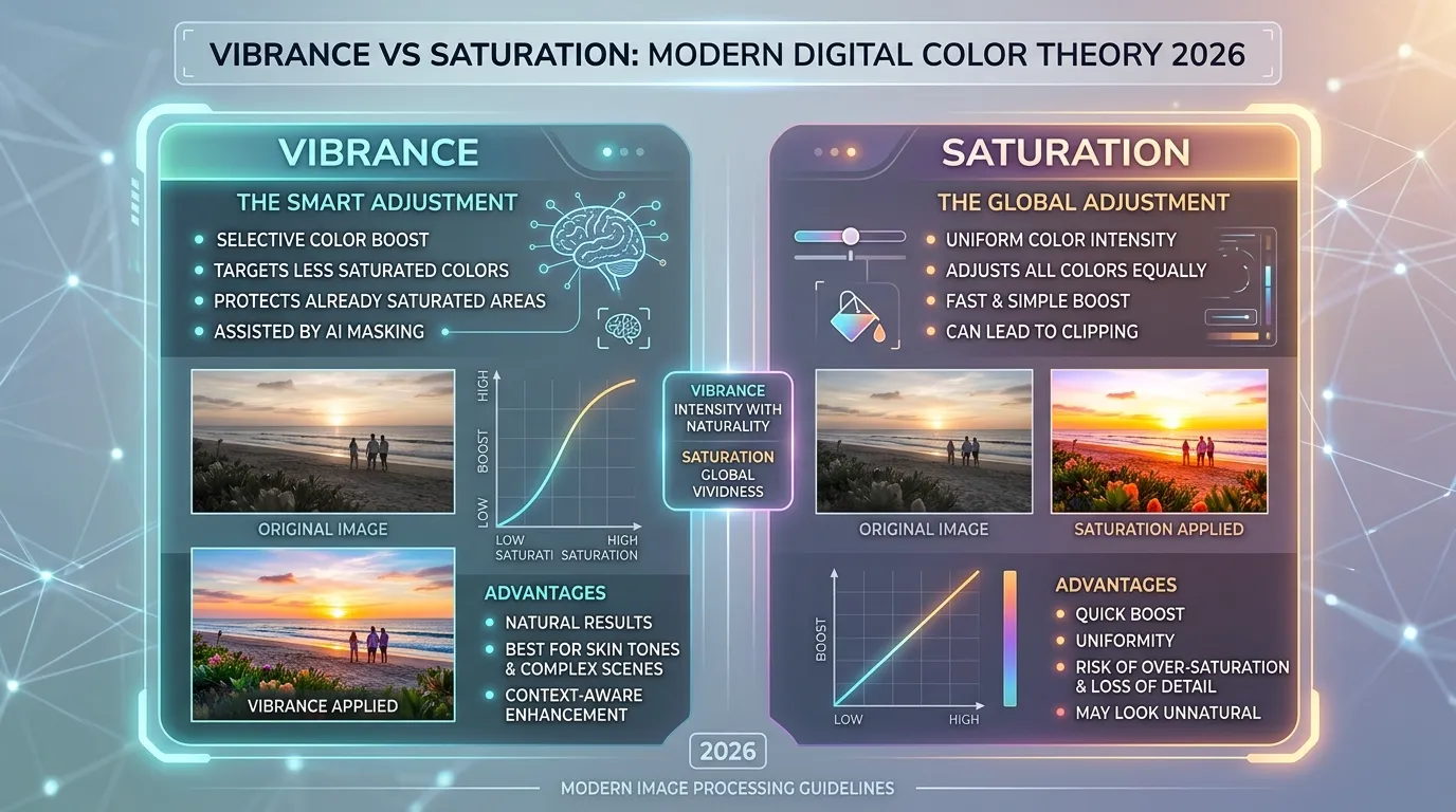
Vibrance is a photo editing tool that increases dull colors in an image. It works gently. It protects skin tones and already bright colors. Because of this, photos look natural.
Vibrance is often used in portrait photos, travel pictures, and nature shots. It gives life to soft colors without making the image look too strong.
History of Vibrance
The term “vibrance” became popular with digital photo editing software in the early 2000s. Programs like Adobe Photoshop added the vibrance tool to help users improve colors in a smart way. Before this, editors mostly used saturation. However, saturation often made skin look too orange or too red. Vibrance solved this problem by changing weak colors more carefully. Over time, photographers and social media creators started using vibrance for cleaner and softer edits. Today, it is common in many editing apps and phone filters.
What is “Saturation”?
Saturation is the strength or intensity of all colors in an image. When you increase saturation, every color becomes brighter and richer. When you lower it, colors become dull or gray.
Saturation changes the whole image equally. Because of this, photos can look bold, dramatic, or even unnatural if used too much.
History of Saturation
The idea of saturation comes from color theory and art studies. Painters and printers used color intensity long before digital cameras existed. In photography, saturation became very important with the rise of digital editing in the 1990s. Editing software gave users full control over image colors. Designers and advertisers used saturation to create eye-catching posters and magazine covers. Later, social media apps also included saturation controls. Today, saturation is one of the most common color tools in photography, filmmaking, and graphic design.
Vibrance vs Saturation
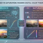
Vibrance softly boosts weak colors, while saturation boosts all colors equally.
Both tools improve colors in photos. However, they create different results. Let us now explore them in detail.
How “Vibrance” Works
Vibrance looks for dull colors in a photo and improves them carefully.
Key Features
- Changes weak colors more than strong colors
- Protects skin tones
- Creates natural-looking photos
- Good for portraits and travel images
- Prevents over-editing
Example Sentences
🔵 The editor increased vibrance to make the flowers look fresh.
🔵 I used vibrance to improve the beach photo without changing the skin color.
Uses
- Photo editing
- Social media pictures
- Wedding photography
- Nature photography
- School design projects
How “Saturation” Works
Saturation increases or decreases the strength of every color in a photo.
Key Features
- Changes all colors equally
- Makes photos bold and dramatic
- Can create artistic effects
- Easy to notice in edited images
- May look unnatural if overused
Example Sentences
🟢 The designer raised saturation to create a colorful poster.
🟢 He lowered saturation to make the photo look old and soft.
Uses
- Advertising
- Graphic design
- Movie posters
- Fashion photography
- Art projects
Which One Should You Use?
Use vibrance if you want natural colors and soft editing. It is best for portraits and daily photos.
Use saturation if you want strong, bright, and dramatic colors. It is better for creative art and bold designs.
10 Differences Between Vibrance and Saturation
1. Editing Style
Vibrance: Works softly and carefully.
🔴 Vibrance made the sky brighter but kept the face natural.
🔴 The photo looked fresh after a small vibrance boost.
Saturation: Changes all colors strongly.
🔴 Saturation made every color very bright.
🔴 The image looked bold after high saturation.
2. Skin Tone Protection
Vibrance: Protects skin tones.
🔴 Her face still looked natural after using vibrance.
🔴 Vibrance kept the portrait soft and clean.
Saturation: Can make skin too red or orange.
🔴 The face looked too orange after high saturation.
🔴 Saturation changed the skin color heavily.
3. Color Control
Vibrance: Targets dull colors more.
🔴 Vibrance improved only the weak colors.
🔴 The grass became greener without affecting the sky much.
Saturation: Affects every color equally.
🔴 Saturation brightened all parts of the image.
🔴 Every object looked colorful after editing.
4. Natural Look
Vibrance: Gives a realistic look.
🔴 The mountains looked natural with vibrance.
🔴 The image stayed soft and balanced.
Saturation: Can look artificial.
🔴 The colors looked fake after too much saturation.
🔴 The photo became too intense.
5. Best Use
Vibrance: Best for portraits and travel photos.
🔴 Vibrance improved the family picture nicely.
🔴 The travel photo looked fresh and clear.
Saturation: Best for posters and art.
🔴 Saturation made the ad stand out.
🔴 The painting looked dramatic with high saturation.
6. Editing Risk
Vibrance: Safer for beginners.
🔴 Beginners often start with vibrance.
🔴 Small vibrance changes improve photos gently.
Saturation: Easy to overuse.
🔴 Too much saturation ruined the picture.
🔴 The colors became painful to view.
7. Color Balance
Vibrance: Keeps balance in the image.
🔴 Vibrance kept the sunset smooth.
🔴 The picture looked even and calm.
Saturation: Can break color balance.
🔴 Saturation made the sky too bright.
🔴 Some colors became stronger than others.
8. Mood
Vibrance: Creates a soft and lively mood.
🔴 Vibrance made the garden feel peaceful.
🔴 The image looked cheerful but calm.
Saturation: Creates a bold mood.
🔴 Saturation gave the poster strong energy.
🔴 The image looked exciting and loud.
9. Professional Use
Vibrance: Often used in professional portrait editing.
🔴 Wedding photographers use vibrance a lot.
🔴 The editor used vibrance for a clean finish.
Saturation: Often used in advertising.
🔴 Saturation helped the product ad look bright.
🔴 Designers used saturation for eye-catching colors.
10. Final Result
Vibrance: Produces soft enhancement.
🔴 The final image looked polished and real.
🔴 Vibrance improved the photo naturally.
Saturation: Produces strong enhancement.
🔴 Saturation made the colors pop heavily.
🔴 The final image looked intense and vivid.
Why People Get Confused About Their Use
People get confused because both vibrance and saturation change colors in photos. At first, they seem the same. Many editing apps also place these tools close together. However, vibrance changes dull colors gently, while saturation changes all colors strongly. Beginners may not notice the small difference right away.
Table: Difference and Similarity
| Feature | Vibrance | Saturation | Similarity |
| Color Change | Soft | Strong | Both improve colors |
| Skin Tone | Protected | Often affected | Both edit images |
| Editing Style | Natural | Bold | Both are photo tools |
| Best For | Portraits | Posters | Both help creativity |
| Risk Level | Low | High | Both need balance |
| Color Focus | Weak colors | All colors | Both control color intensity |
Which is Better in What Situation?
Vibrance is better when you want natural beauty. It works well for selfies, family photos, and travel pictures. It keeps faces soft and realistic.
Saturation is better when you want bright and dramatic colors. It is useful for advertisements, artwork, and fashion images. It helps photos grab attention quickly.
How Are “Vibrance” and “Saturation” Used in Metaphors and Similes?
🟣 “Her smile added vibrance to the room.”
🟣 “The festival was full of saturation, like a rainbow explosion.”
🟣 “His art had the vibrance of spring flowers.”
🟣 “The movie scene was saturated with emotion.”
Connotative Meaning
Vibrance usually has a positive meaning. It suggests life, energy, and freshness.
🟣 “The city has vibrance and joy.”
🟣 “Her painting showed vibrance and hope.”
Saturation can be positive or negative depending on context.
🟣 “The image had rich saturation.”
🟣 “The market reached saturation and stopped growing.”
Idioms or Proverbs
🟣 “Add color to life” — Means to make life exciting.
Example: Travel adds color to life.
🟣 “Paint the town red” — Means to celebrate wildly.
Example: They painted the town red after graduation.
Works in Literature
🟣 The Picture of Dorian Gray — The Picture of Dorian Gray by Oscar Wilde (1890) uses rich color imagery and emotional vibrance.
🟣 To the Lighthouse — To the Lighthouse by Virginia Woolf (1927) describes soft shades and changing visual moods.
Movies Related to the Keywords
🟣 Coco — 2017, USA — Famous for vibrant colors and rich visual style.
🟣 Avatar — 2009, USA — Uses highly saturated fantasy visuals.
🟣 Life of Pi — 2012, USA/Taiwan — Known for colorful cinematic scenes.
Questions
1. Is vibrance the same as saturation?
No. Vibrance changes dull colors softly, while saturation changes all colors strongly.
2. Which is better for portraits?
Vibrance is usually better because it protects skin tones.
3. Can too much saturation ruin a photo?
Yes. High saturation can make photos look fake and harsh.
4. Do phones have vibrance tools?
Yes. Many editing apps and phones include vibrance controls.
5. Can I use both together?
Yes. Many editors use small amounts of both for balanced results.
Final Words
Learning photo editing becomes easier when you understand simple color tools. Vibrance and saturation may look similar, but they create different effects. With practice, you will know when to use soft color changes and when to use bold ones. Keep editing, testing, and learning from your own photos.
Conclusion
The difference between vibrance and saturation is simple once you understand how each tool changes color. Vibrance works gently and protects natural tones, while saturation boosts every color strongly. Both tools are useful, but they fit different situations. Vibrance is better for realistic photos, and saturation is great for dramatic effects. If you use them carefully, your images can look beautiful, balanced, and professional. Start with small edits, compare the results, and enjoy creating colorful photos with confidence.

I’m Zahid Abbas, an educator, researcher, and digital publishing strategist with a passion for linguistics, grammar, and clear communication. As a content creator and SEO specialist, I craft research-driven, reader-focused content that empowers learners and makes knowledge accessible worldwide.