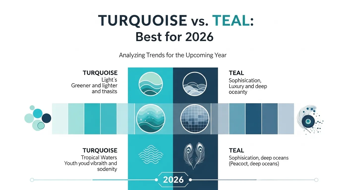
Imagine decorating a room or choosing clothes online. You see two beautiful blue-green colors: turquoise and teal. At first glance, they may look almost the same, so many people mix them up. Both belong to the blue-green family and are popular in fashion, art, design, and home décor. However, they are not identical.
Their tone, brightness, and mood are different. Knowing the difference between turquoise and teal can help you pick the right color for style, branding, painting, or interior design. One feels lighter and brighter, while the other feels deeper and richer.
In this guide, we will clearly explain the difference between turquoise and teal using simple words so anyone can understand and use them with confidence.
Key Difference Between Turquoise and Teal
The main difference is their color balance:
- Turquoise is a brighter, lighter mix of blue and green, often with more blue and a fresh tropical feel.
- Teal is darker, deeper, and more muted, with stronger blue-green richness.
Turquoise feels lively and airy. Teal feels elegant and calm.
Pronunciation of Both
- Turquoise
- US: /ˈtɝː.kwoɪz/
- UK: /ˈtɜː.kwɔɪz/
- Teal
- US: /tiːl/
- UK: /tiːl/
Both are beautiful colors, but their character becomes clearer when compared side by side.
Difference Between Turquoise and Teal
| Feature | Turquoise | Teal |
| Shade | Light to medium blue-green | Medium to dark blue-green |
| Brightness | Bright and vivid | Muted and rich |
| Tone | Fresh and cheerful | Sophisticated and calm |
| Blue Content | Usually stronger blue | Balanced blue-green |
| Green Content | Moderate green | Often stronger green than turquoise |
| Use in Fashion | Summer, casual, beachwear | Formal, elegant, autumn/winter |
| Use in Design | Tropical, playful themes | Professional, luxury themes |
| Named After | Turquoise gemstone | Eurasian teal duck |
| Mood | Energetic, youthful | Stable, refined |
Nature and Behavior of Both Colors
- Turquoise: Bright, eye-catching, refreshing, youthful.
- Teal: Deep, grounded, stylish, mature.
Turquoise grabs attention faster, while teal blends elegance with color.
Why People Confuse Their Use
People confuse them because:
- Both are blue-green shades.
- Screens may show colors differently.
- Many brands label shades loosely.
- Lighting changes how each color looks.
- Some palettes place them close together.
10 Clear Differences with Examples
1. Lightness
- Turquoise: Lighter.
Example: Beach water color.
Example: Bright summer scarf. - Teal: Darker.
Example: Velvet sofa.
Example: Evening dress.
2. Energy
- Turquoise: More lively.
Example: Kids’ room paint.
Example: Festival jewelry. - Teal: More calm.
Example: Office wall.
Example: Study room décor.
3. Formality
- Turquoise: Casual.
Example: Flip-flops.
Example: Resort shirt. - Teal: Formal.
Example: Wedding suit tie.
Example: Luxury packaging.
4. Seasonal Feel
- Turquoise: Spring/summer.
Example: Pool towels.
Example: Vacation ads. - Teal: Autumn/winter.
Example: Wool coat.
Example: Holiday décor.
5. Visibility
- Turquoise: Stands out more.
Example: Sports bottle.
Example: Poster accent. - Teal: Softer impact.
Example: Website background.
Example: Business logo.
6. Pairing Colors
- Turquoise: Works with coral, white, yellow.
Example: Beach theme.
Example: Summer nails. - Teal: Works with gold, gray, cream.
Example: Hotel branding.
Example: Formal event cards.
7. Emotional Mood
- Turquoise: Happy and open.
Example: Spa sign.
Example: Toy design. - Teal: Wise and secure.
Example: Bank logo.
Example: Law office brand.
8. Material Look
- Turquoise: Great in glossy surfaces.
Example: Ceramic mug.
Example: Nail polish. - Teal: Great in matte or velvet.
Example: Couch fabric.
Example: Matte wall paint.
9. Common Inspiration
- Turquoise: Gemstone and sea water.
Example: Necklace stone.
Example: Tropical lagoon photo. - Teal: Bird feather and deep water.
Example: Feather art.
Example: Dark lake tone.
10. Popular Uses
- Turquoise: Travel, beauty, youth brands.
Example: Swimwear logo.
Example: Summer campaign. - Teal: Corporate, wellness, luxury brands.
Example: Tech logo.
Example: Spa packaging.
Which Is Better in What Situation?
Turquoise is better when you want freshness, fun, or bright energy. It works well for summer fashion, beach themes, playful branding, and cheerful spaces. If you want a room to feel open and lively, turquoise is a strong choice.
Teal is better when you want elegance, calm, or a premium feel. It fits offices, formal clothing, serious branding, and stylish interiors. If you want depth without using dark navy or black, teal works beautifully.
How Are the Keywords Used in Metaphors and Similes?
- Turquoise suggests tropical beauty or freshness.
Example: “Her eyes were turquoise like clear island water.” - Teal suggests depth or sophistication.
Example: “The room wore teal like quiet confidence.”
Connotative Meaning of Both Keywords
- Turquoise – Positive
Means freshness, healing, youth, creativity. - Teal – Positive/Neutral
Means balance, trust, calm, luxury.
Idioms or Proverbs Related to the Words
There are no major English idioms using these exact color names, but color sayings apply:
- True colors
Example: The brand showed its true colors with a teal redesign. - Green with envy
Example: She was green with envy over the turquoise ring.
Works in Literature Using the Names
- Turquoise by A. A. Milne (poem reference in collections, 20th century)
- Teal appears more often as a descriptive color in modern fiction rather than famous titles.
Movie Names Made on Keywords
- Turquoise Rose (2007, USA) Turquoise Rose
- No major globally known film simply titled Teal.
Five Frequently Asked Questions
1. Is turquoise blue or green?
Mostly blue-green, often leaning blue.
2. Is teal darker than turquoise?
Yes, usually.
3. Which color is more modern?
Teal is often seen as more modern and professional.
4. Which color is brighter?
Turquoise.
5. Can I use them together?
Yes, they can pair well if shades are balanced.
How Are Both Useful for Surroundings?
Both colors improve spaces in different ways. Turquoise can make rooms feel bright and refreshing. Teal can make rooms feel calm and elegant. In branding, both attract attention while feeling more creative than plain blue or green.
Final Words for Both
Turquoise shines with light, fun energy. Teal offers rich, timeless style.
Conclusion
The difference between turquoise and teal is mainly depth and brightness. Turquoise is lighter, brighter, and more playful. Teal is darker, richer, and more refined. Both are excellent colors with unique moods and uses. If you want freshness and sparkle, choose turquoise. If you want elegance and calm strength, choose teal. Understanding the difference between turquoise and teal helps you choose the perfect shade for clothing, décor, branding, or art.

I’m Zahid Abbas, an educator, researcher, and digital publishing strategist with a passion for linguistics, grammar, and clear communication. As a content creator and SEO specialist, I craft research-driven, reader-focused content that empowers learners and makes knowledge accessible worldwide.