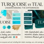
Imagine you are painting a room in your home. You want a fresh, calm look, so you choose a blue-green color. At the paint shop, you see two shades: turquoise and teal. They look alike, but they are not the same. Turquoise is a bright color that blends blue with green and often looks like clear tropical water. Teal is a deeper blue-green color that often looks darker and richer. The difference between turquoise and teal can help you choose the right shade for clothes, home decor, art, and design. The difference between turquoise and teal also matters when you want colors to match well. Both colors can look lovely, but each creates a different mood. Let us learn how to tell them apart with simple facts and examples.
Key Difference Between the Two
The main difference is their shade and feel.
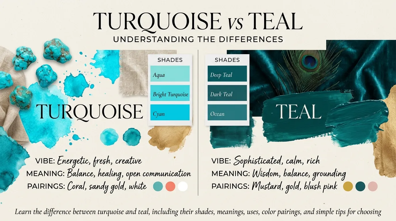
- Turquoise is often bright, fresh, and lively. It has a strong blue look with a touch of green.
- Teal is often darker, deeper, and calmer. It has a rich mix of blue and green.
The exact shade can change from one paint brand, screen, or fabric to another.
Why Is Their Difference Important for Learners and Experts?
Knowing the difference between turquoise and teal helps students, artists, designers, and shoppers make better choices. A student can name colors more clearly. An artist can choose the right shade for a painting. A fashion designer can match clothes and accessories. An interior designer can create the mood a room needs.
These colors also play a role in ads, websites, logos, and public spaces. A bright turquoise shade may feel fresh and fun. A deep teal shade may feel calm and formal. When people know the difference, they can explain what they want and avoid color mistakes.
Pronunciation of Turquoise and Teal
- Turquoise
- US English: TUR-kwoyz
- UK English: TUR-kwoyz
- Teal
- US English: teel
- UK English: teel
A Simple Link to the Main Topic
Now that we know the basic meaning of each color, let us look at ten key points. These will help you choose the right shade for art, clothes, rooms, and other uses.
Difference Between Turquoise and Teal
1. Color Shade
Turquoise: Turquoise is often a bright blue-green shade. It may look more blue or more green, based on the exact shade.
- Example 1: A turquoise cup looks bright and fresh on a white table.
- Example 2: A turquoise scarf adds a clear pop of color to a plain outfit.
Teal: Teal is usually a darker blue-green shade. It often has a rich and deep look.
- Example 1: A teal sofa gives a living room a deep color.
- Example 2: A teal shirt looks rich with black trousers.
2. Brightness
Turquoise: Turquoise often looks bright and lively. Light turquoise shades can look soft and airy.
- Example 1: A bright turquoise wall can make a playroom feel cheerful.
- Example 2: A light turquoise dress can look fresh on a sunny day.
Teal: Teal often looks darker and less bright than turquoise.
- Example 1: A dark teal curtain gives a room a rich look.
- Example 2: A teal notebook looks bold beside a white pen.
3. Mood and Feeling
Turquoise: Turquoise can suggest fun, energy, peace, and fresh air.
- Example 1: A turquoise pool may remind people of a sunny beach.
- Example 2: A turquoise poster can give a summer event a lively feel.
Teal: Teal can suggest calm, balance, trust, and style.
- Example 1: A teal office wall may create a calm work space.
- Example 2: A teal invitation can look neat and formal.
These feelings are common color ideas, not fixed rules. People may react to colors in different ways.
4. Link to Nature
Turquoise: Turquoise often brings to mind clear sea water, tropical lagoons, and bright skies.
- Example 1: The sea near a tropical island may look turquoise in the sun.
- Example 2: A turquoise gem can remind people of clear water.
Teal: Teal often brings to mind deep water, some bird feathers, and dark green-blue plants.
- Example 1: A bird with teal feathers may look rich and striking.
- Example 2: Teal paint can give a room a deep, nature-inspired feel.
5. Use in Fashion
Turquoise: Turquoise works well for bright summer clothes, beachwear, and bold accessories.
- Example 1: A turquoise necklace adds color to a white dress.
- Example 2: Turquoise sandals can brighten a simple summer outfit.
Teal: Teal works well for formal clothes, coats, dresses, and rich-looking accessories.
- Example 1: A teal suit can look smart at a work event.
- Example 2: A teal scarf can add depth to a gray coat.
6. Use in Home Decor
Turquoise: Turquoise can make a room feel light, fresh, and open.
- Example 1: Turquoise cushions add color to a cream sofa.
- Example 2: A turquoise vase can brighten a plain shelf.
Teal: Teal can make a room feel rich, warm, and calm.
- Example 1: A teal feature wall can stand out in a living room.
- Example 2: Teal bedding can add depth to a bedroom.
7. Use in Art and Design
Turquoise: Artists may use turquoise to show bright water, tropical scenes, or a lively mood.
- Example 1: An artist paints a turquoise sea under a clear sky.
- Example 2: A designer uses turquoise in a poster for a beach event.
Teal: Artists may use teal to add depth, contrast, or a calm mood.
- Example 1: An artist uses teal shadows to make a painting look deeper.
- Example 2: A designer uses teal on a book cover to create a rich look.
8. Color Mixing
Turquoise: Turquoise is made by mixing blue and green. Adding white can make it lighter. The exact result depends on the paints used.
- Example 1: An artist adds a little green to blue paint to make turquoise.
- Example 2: An artist adds white to make a pale turquoise shade.
Teal: Teal is also made from blue and green, but it is often darker. A small amount of black or a darker blue may deepen the shade.
- Example 1: An artist mixes blue and green, then adds a little dark paint to make teal.
- Example 2: A painter uses more dark blue to make a deep teal shade.
9. Use in Branding
Turquoise: Brands may use turquoise to suggest freshness, creativity, travel, or a modern feel.
- Example 1: A travel poster uses turquoise to show clear sea water.
- Example 2: A summer drink label uses turquoise to feel fresh.
Teal: Brands may use teal to suggest trust, balance, skill, or a calm style.
- Example 1: A business uses teal on its website to create a steady look.
- Example 2: A wellness brand uses teal in its logo for a calm feel.
Color alone does not prove that a brand is safe or reliable.
10. Best Color Pairings
Turquoise: Turquoise often pairs well with white, cream, coral, sand, and light gray.
- Example 1: A turquoise shirt looks fresh with white shorts.
- Example 2: Turquoise cushions look bright with a cream sofa.
Teal: Teal often pairs well with gold, cream, gray, navy, and warm brown.
- Example 1: A teal dress can look elegant with gold jewelry.
- Example 2: A teal wall can work well with cream furniture.
Both colors can pair with many shades. The best match depends on the light, material, and look you want.
Nature and Behaviour of Turquoise
Turquoise is often seen as bright, clear, and lively. It sits between blue and green, so it can remind people of both water and plants. Light turquoise may feel soft and gentle, while bright turquoise can stand out.
Turquoise can work well when you want a room, outfit, or design to feel fresh. It can also draw the eye when used in small amounts. Too much bright turquoise may feel strong to some people, so it can help to pair it with calm colors such as white or cream.
Nature and Behaviour of Teal
Teal is often deeper and richer than turquoise. It sits between blue and green but usually has a darker look. This can make it useful when you want a space or design to feel calm and bold at the same time.
Teal works well on walls, clothes, furniture, and logos. It can look modern with gray and white. It can also look warm with gold, tan, or wood. Light teal shades may feel soft, while dark teal shades may look formal and strong.
also read more about https://comparificationn.com/difference-between-stain-and-paint-2/
Why Are People Confused About Turquoise and Teal?
People confuse turquoise and teal because both are blue-green colors. Their shades can also change with the light, the material, and the screen used to show them.
Some turquoise shades are dark, while some teal shades are light. This means the two colors can look close to each other. Paint makers and clothing brands may also use different names for similar shades.
A simple way to tell them apart is to compare the colors side by side. Turquoise often looks brighter and more blue. Teal often looks deeper and darker. Still, there is no single shade that all brands use for each name.
Table Showing the Differences and Similarities
| Feature | Turquoise | Teal |
| Main color family | Blue-green | Blue-green |
| Usual shade | Brighter | Deeper and darker |
| Common mood | Fresh and lively | Calm and rich |
| Nature link | Clear tropical water | Deep water and bird feathers |
| Fashion use | Summer clothes and bold accessories | Formal clothes and rich accessories |
| Home decor | Bright accents and light spaces | Feature walls and deep accents |
| Design use | Fresh, lively designs | Calm, balanced designs |
| Common pairings | White, coral, cream | Gold, gray, cream |
| Similarity | Both mix blue and green | Both mix blue and green |
| Key point | Often brighter | Often deeper |
Which Is Better in What Situation?
Turquoise is better when you want a bright and fresh look. It can work well in summer clothes, beach themes, children’s rooms, and lively posters. It also pairs well with white, coral, and cream. Use it when you want a color to catch the eye or bring to mind clear water. A light turquoise shade can also work well in a small room because it may feel open and airy.
Teal is better when you want a deep and calm look. It can work well in offices, bedrooms, formal clothes, and smart designs. It pairs well with gold, gray, and warm wood. Use teal when you want a color that feels rich but not too bright. Neither color is always better. Your choice depends on the style, light, and mood you want.
How Are Turquoise and Teal Used in Metaphors and Similes?
Turquoise and teal can help writers describe nature, mood, and beauty. They are color words, so writers often use them to create a clear picture in the reader’s mind.
Turquoise in Metaphors and Similes
- Metaphor: “The sea was a sheet of turquoise glass.”
- This means the water looked smooth, bright, and clear.
- Simile: “Her eyes shone like turquoise gems.”
- This compares the color of her eyes to bright blue-green stones.
Teal in Metaphors and Similes
- Metaphor: “The forest was a blanket of teal shadows.”
- This gives the forest a deep, calm color in the writer’s mind.
- Simile: “The evening sky looked like teal silk.”
- This compares the sky’s deep color to smooth cloth.
These are creative examples. They show how color words can help readers picture a scene.
Connotative Meaning of Turquoise and Teal
A color’s connotative meaning is the feeling or idea it brings to mind. These meanings can change across people and cultures.
Turquoise
- Positive meaning: Freshness, peace, joy, and clear water.
- Negative meaning: In some settings, a very bright turquoise may feel too loud or bold.
- Neutral meaning: It can simply name a blue-green shade.
Examples:
- Positive: “The turquoise sea made the beach look calm and bright.”
- Negative: “The bright turquoise wall felt too strong for the small room.”
- Neutral: “She chose turquoise paint for the door.”
Teal
- Positive meaning: Calm, balance, trust, and style.
- Negative meaning: A very dark teal may feel heavy in a room with little light.
- Neutral meaning: It can simply name a deep blue-green shade.
Examples:
- Positive: “The teal room felt calm and neat.”
- Negative: “The dark teal made the room look smaller.”
- Neutral: “He bought a teal notebook.”
These meanings are common ideas, not facts about every person or place.
Idioms and Proverbs Related to Turquoise and Teal
There are no widely used English idioms or proverbs that focus on turquoise or teal by name. However, some common expressions about color can help explain how people use color words.
- “True colors.” This means a person’s real nature or feelings.
- Example: “When the team faced trouble, he showed his true colors.”
- “A sea of color.” This phrase means a large area full of many colors.
- Example: “The art show was a sea of color, with turquoise and teal in many paintings.”
- “Green with envy.” This means to feel very jealous. It is about the color green, not turquoise or teal.
- Example: “She was green with envy when she saw her friend’s new teal car.”
These expressions are related to color in general. They are not special idioms for turquoise or teal.
Works in Literature Related to Turquoise and Teal
Turquoise and teal are often used in descriptions of nature, clothes, gems, and places. However, there are few well-known literary works whose main subject is either color by name. The works below use color, nature, or visual detail as part of their themes; they are not necessarily about turquoise or teal alone.
- The Great Gatsby — Novel, F. Scott Fitzgerald, 1925. It uses color and visual images to show wealth, hope, and social life.
- The Color Purple — Novel, Alice Walker, 1982. It explores life, family, pain, and hope. The title uses a different color.
- The Blue Castle — Novel, L. M. Montgomery, 1926. Its title and setting use color to suggest escape and hope.
These books are related to color and imagery, not direct studies of turquoise and teal.
Movies Related to Turquoise and Teal
There are no widely known major films focused only on turquoise or teal as their main subject. But many films use blue-green colors in their scenes, costumes, or visual style.
- The Shape of Water — 2017, United States. This fantasy drama uses blue-green tones in many scenes.
- Aquaman — 2018, United States. This superhero film uses sea colors in its underwater world.
- Avatar — 2009, United States. This science-fiction film uses strong blue and green colors to build its world.
These films are linked to blue-green visuals. They are not stories about the colors themselves.
Five Possible Asked Questions
1. Is turquoise the same as teal?
No. Both are blue-green colors, but turquoise is often brighter, while teal is often darker and deeper.
2. Which color is lighter, turquoise or teal?
Turquoise is usually lighter and brighter. But the exact shade can change by paint, fabric, or screen.
3. Can turquoise and teal go together?
Yes. They can work together because they share blue and green tones. Use one as the main color and the other as an accent to keep the look balanced.
4. Which color is better for a bedroom?
Both can work well. Light turquoise can make a room feel fresh and open. Teal can make it feel deep and calm. Your choice depends on the room’s light and your style.
5. Are turquoise and teal warm or cool colors?
Both are usually seen as cool colors because they contain blue. A shade with more green may feel warmer to some people, but both often create a cool look.
How Are Turquoise and Teal Useful for Our Surroundings?
Turquoise and teal can make homes, schools, offices, shops, and public spaces look more inviting. Turquoise can add a bright touch to walls, signs, and art. Teal can bring depth to furniture, doors, and room designs. Both can help people show a style or create a mood.
These colors can also help with clear visual design. For example, a designer may use turquoise to draw attention to a poster. A designer may use teal to make a website feel calm. The key is to use enough contrast so words and signs are easy to read. Color choices should also suit the space, the light, and the people who use it.
Final Words on Turquoise and Teal
Turquoise and teal are close in color, but they can create different looks. Turquoise is often bright, fresh, and lively. Teal is often deep, rich, and calm. Both work well in clothes, art, home decor, and design. The best choice depends on what you want to show. Compare shades in the light where they will be used, because colors can look different on screens and in real life. You can also use both together to create a balanced look.
Conclusion
The difference between turquoise and teal is easy to see when you compare their usual shades. Turquoise often looks brighter and brings to mind clear water, fresh air, and lively spaces. Teal often looks darker and brings to mind depth, calm, and rich style. Both colors blend blue and green, and both can work well in clothes, art, home decor, and branding. Still, the exact shade may change with paint, fabric, light, or a digital screen. Try each color beside the other before you make a final choice. Choose turquoise for a fresh, bright look, or teal for a deeper, calmer feel. You can also pair them to make a pleasing color scheme.

I’m Zahid Abbas, an educator, researcher, and digital publishing strategist with a passion for linguistics, grammar, and clear communication. As a content creator and SEO specialist, I craft research-driven, reader-focused content that empowers learners and makes knowledge accessible worldwide.